HELP CENTER · GETTING STARTED
Layouts, themes and your branding
Every guide has six layouts (App, Card, Editorial, Field Guide, Noir and Retreat) and your content is identical in all of them: switching is one click and the live preview restyles instantly. Fifteen themes, custom colors, your cover and logo, and a shelf of title typefaces layer on top.
The design controls
Step 1. Pick a layout
Scroll to Layout in the editor and click any of the six cards. The live phone restyles at once.
- App: splash cover, a Get Started button and a tab bar. The default for new guides.
- Card: friendly tiles with icons.
- Editorial: boutique-magazine serif with hairline rules.
- Field Guide: numbered contents, mono details, framed photo.
- Noir: moody dark surfaces with your accent as the gold.
- Retreat: your photo is the whole page; glass cards float on it.
Step 2. Theme and colors
- Under Theme, click one of the fifteen swatches. Paper, the near-white one, comes first; the rest run from warm terracotta and sage to after-dark looks.
- Open Custom colors for exact brand values.
Light themes tint the page and keep the cards white with a darker navigation bar; dark themes do the reverse. Every theme works with every layout.
Step 3. Cover, logo and home screen text
- Cover photo: Upload photo or Choose from library. A separate mobile cover photo is optional, for a tighter crop on phones.
- Logo: overlays the top-left corner of the cover. A PNG with a transparent background works best.
- Home screen text: title size, color, alignment, and the overlay that keeps text readable on a busy photo.
Step 4. Title typeface
The title typefaces range from clean sans to editorial serif to script. The typeface applies to the guide title and section headings; body text stays optimized for reading on phones.
Step 5. Preview both sizes
Flip the live preview between Mobile and Desktop before publishing. The same guide is tap-friendly on a phone and a full spread on a laptop, from the same link.
Once the guide is published, the QR code in the sharebar opens the real thing on your own phone.
Common questions
Will switching layouts rearrange my content?
No. Sections, cards, photos and buttons are identical across all six layouts; only the presentation changes.
Can different properties use different layouts?
Yes, every guide chooses independently. Many hosts match the layout to the property: Noir for the city loft, Field Guide for the cabin.
Does the TV screen use the same look?
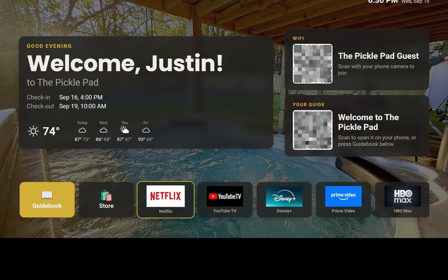
Yes. A Tabellara TV in the house shows the guide's cover, theme colors and title typeface on its home screen, and the guide itself in a remote-friendly reader.
Do themes affect the WiFi sign-in page too?
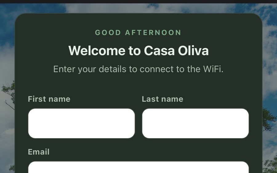
Guest WiFi sign-in pages follow the guide's look by default and can be styled separately in their own editor. See Design the WiFi sign-in page.
Go further
A guidebook is the start of the stay. These run on it, at the same properties, from the same dashboard.
Guest WiFi
Guests join your network through a branded sign-in page and land in the guidebook. Every name and email is yours to keep. Runs on the UniFi gear you already own: $6 a network, the first free for 30 days.
Guest TV
Your guidebook on the onn or Google TV in the living room: a welcome by name, the WiFi and guide codes on screen, and every app signed out at checkout. $6 a property for up to three TVs, the first free for 30 days.
Still stuck?
Email support@tabellara.com and a human will help; we usually reply the same day.
All help articles